Ground-breaking computer games
Now that many are talking about the ZX Spectrum due to the passing of Clive Sinclair. It would be remiss of me to add that Mike Singleton’s “The Lords of Midnight” was the most innovative sandbox adventure/strategy games of its age and is not as celebrated as it should be. pic.twitter.com/NS1PHqLdUW
— Jay Gunn (@GunnComics) September 17, 2021
This tweet got me thinking: what are those watershed games that changed the industry’s perception of what was possible, and how did they do it? I’ll start with one: Pitfall!
To understand how amazing Pitfall was, you have to understand a little about the Atari 2600. It didn’t have a frame buffer - instead it had a video chip (the TIA) that could draw a scan line based on 6 elements: a background, plus 5 sprites: 2 players, 2 missiles, and a ball.
The background had a 2 color registers plus 20 bits indicating which color should be drawn for the left 80 pixels of the screen (each bit controlled 4 adjacent pixels). For the right half, the same 20 bits were used, either in the same order or reflected.
The player and missile sprites are paired and each pair gets a single color. The player sprites are 8 bits of on/off plus position and the missiles are 1 bit plus position. Finally, there’s the independent ball sprite which is 1 bit as well, and uses the background color.
The player/missile pairs can be replicated up to 3 times on a scan line, and the 1-bit elements can be stretched to cover 1, 2, 4, or 8 pixels.
Combat uses the chip as intended. Each row in the game is 80 pixels on the left, reflected on the right, with pixels colored in 4-pixel chunks. Each player has a tank or plane (or three) of a single color, and can shoot missiles at their opponent’s tanks.

Note that all these elements are one-dimensional. So when drawing a tank, the CPU has to wait until the first scan line where the tank is, then load the TIA with that slice, wait until the end of that scan line, load the TIA with the next slice, and do on.
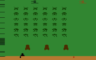
The TIA is why the 2600 version of Space Invaders has 6 columns of aliens: it’s using the two player sprites each replicated three times. Now there is a trick going on here, because aliens get shot down independently.

The programmer set the two player sprites to “wide replication,” which spread them out enough that they could be interleaved “A B A B A B.” Then there was just enough time (two CPU cycles to be exact) between the drawing of two copies to change the bitmap.
This is part of the fun of direct hardware - it’s all just electrical signals. So when it’s clocking out another pixel, it just takes what’s in the register at that point in time. You better get your timing down exactly!
Adventure added a couple of other innovations that preceded Pitfall. First, the “world” is bigger than a screen. So when the player moves off the screen in one direction, they find themselves on a different screen.
Adventure also has more moving objects than there are sprites, so when there were too many things on the screen - bats, dragons, the sword, etc. - the components started flashing. The code uses a sprite for one item one frame and a different one on the next.
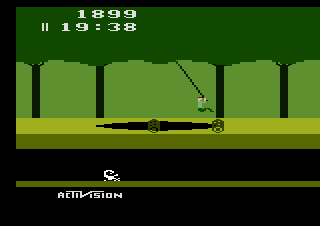
Now to Pitfall. Compared to its predecessors, the look and feel is totally different. It has a rich background, with vines, pits that open and close, and lots of moving obstacles with no flashing. How did they do it?

At some level it’s the same tricks mentioned above: you reuse the sprites for different things on different scan lines, or even on the same scan line. But they took it to a qualitatively different level. In large part, the advances were mostly in the play field.
First, both colors in the background element are used, and they vary as the scan lines move down, in eight regions. At the top is solid dark green for the tree tops, then dark and light green to form the canopy edge, and so on.
You can tell when the background element is being used because it’s almost always reflected across the middle. So the tree trunks vary, but they always mirror across the middle. Also, the colors always change at 4-pixel boundaries.
Second, they use player sprites for fine details in the background: the 1-pixel tree branches, the brick walls, the timer and score. See how much nicer the timer and score numbers look relative to those in Combat. The ones in Combat use the background element.
Third, the animation of the background element to make the pits that open and close.
Because they use one player sprite for the game character, they only have one more to use for any scan line where the player could be. This is why you never see a scorpion on a screen with a brick wall, or a fire combined with rolling logs.
However, because they were careful about ensuring that they never needed more than a single non-character sprite per scan line, they never get the flashing that detracted from Adventure.
The play field is what really sets the look and feel for the game, but I’ll note a few other tricks that the game employed.
First, the vines use the ball sprite, which is why if you look closely, the color of the vine changes when it gets up near the canopy. The TIA had collision detection built in, so it could tell the CPU if the player had grabbed the vine - the CPU didn’t have to figure that out.
Second, they changed the color for the character sprite on each scan line, to make the head, shirt, and body. All of these tricks rely on the fact that it’s a side-scroller, so movement is very restricted: the character can’t rotate and most of the movement is lateral.
Finally, they didn’t turn on the TIA to draw a scan line right away - this is why the game has a black region on the left, and the background mirroring isn’t complete.
They didn’t draw those 8 pixels to give them a few more cycles to compute each position on that scan line. Literally three more CPU cycles. The game was that tight that they needed those extra cycles to get everything done.
When Pitfall! was released it felt so much closer to the arcade games of the time. As noted, the restrictions from side-scrolling were a big help. Another game that used restricted movement to deliver its breakthrough experience is Doom. But that’s a story for another time!
